Introducing THIRDHOME’s New Look
September 23, 2020 • By Amy Jo RobertsonTen years strong.
See how we’ve grown!
A Brief History
Over the years just as The Club has evolved, so too has the logo and branding. We are a thriving membership of over 11,000 and continue to welcome new members daily. With the continual evolution of The Club, we felt the time was right to update our branding. We are pleased to share our new logo, the meaning behind it, and a walk down memory lane to see just how far we’ve come in the past ten years.
The concept of THIRDHOME began at the end of 2009 when Founder and CEO Wade Shealy put his dream of creating a private club for second homeowners into action. It sparked from his career in luxury real estate, where he had come to know many second home owners. He noticed a common thread between past clients coming back to resell their dream vacation home and prospective clients who were hesitant to purchase. Both sides expressed a similar FOMO: Fear of missing out on other vacations or travel opportunities because they felt bound to the second home they already owned. With the basic premise of an exchange club scratched out on the back of a napkin, and a commitment from 50 friends and former clients with luxury second homes, THIRDHOME took flight in 2010.
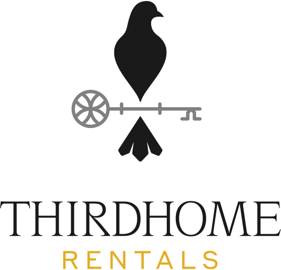
Introducing Our New Logo!
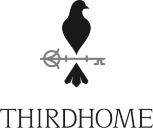
When designing the new logo, we felt it important to add key imagery to the design. Since the beginning, Keys have been at the cornerstone of THIRDHOME. They serve as the currency of The Club and drive all activity within the Exchange. Both figuratively and physically, keys allow the user to open doors or access new opportunities that may otherwise remain closed. That is the essence of THIRDHOME!
The dove has taken more shape and is proudly perched upon a key, ready to take flight. Keep reading to see why the dove was added to the logo in 2013.
Three distinct brands under one luxury umbrella
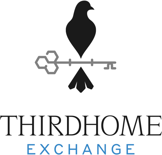
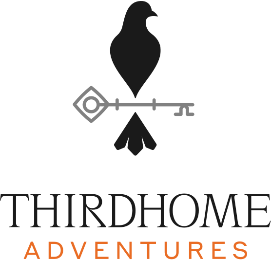
With the addition of two other luxury travel offerings, in 2018 specific colors were designated for each product line.
In the new design, in addition to the assigned color, the key head varies slightly within each brand. The dove mark remains the same.
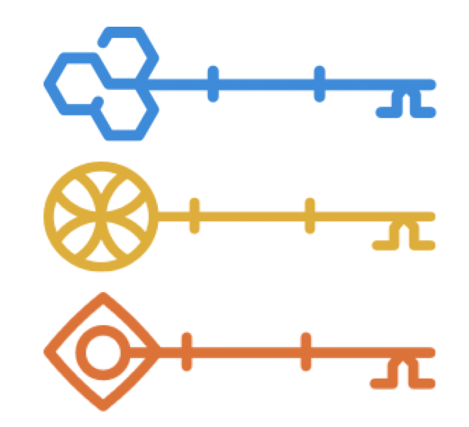
- Exchange: Blue – instills loyalty and trust
- Rentals: Gold – designates wealth and prosperity
- Adventure: Orange -emotes action & adventure
Our Logo Through the Years
2010
It’s all about the home. Coming up with a name was easy, as it was built on the concept of using your second home to access a “3rd Home.” The inaugural logo reflects the basic premise of The Club.
2013
Introducing the dove. Realizing there was more to the story than a single home image, the imagery of a dove was added to the name. The dove species is known to reuse their own or other species’ nests. Great care is made when the dove builds their nest, and many times they will return to that same nesting site year after year.
2016

Luxury and refinement. The bird took on a more sleek design and the font was updated to reflect modern times.
This fresh new logo is just one way The Club is evolving. As we enter our second decade, we will continue to be led by our mission to enrich our members’ lives by inspiring them to travel to new and exciting places, experience different cultures, and create lasting memories, all while saving them time and money.